Okkular//
Website redesign for SaaS startup
Okkular//
Duration: 3.5 weeks
Tasks: I was tasked with leading the direction of the website redesign and UI. I assisted with research and synthesis.
Deliverables: Personas, User Journeys, MVP, High-Fi Prototype
Duration: 2 weeks
Tasks: I was tasked with leading the direction, structure and synthesis of research while assisting with UI.
Deliverables: Personas, User Journeys, MVP, Paper Prototypes, Mid-Fi Prototype
Overview
Overview
Okkular is an Australian based startup whose main goal is to assist the fashion industry. They intend on achieving this goal through "Machine Learning" and Ai Technology. Their tech will seamlessly integrate with eCommerce platforms such as Shopify to catalogue clothing. Where an employee would manually enter in each item of clothing and tag it with the correct attributes, a task taking 3-5 mins; Okkular has reduced the time to 15 seconds.
Okkular is an Australian based startup whose main goal is to assist the fashion industry. They intend on achieving this goal through "Machine Learning" and Ai Technology. Their tech will seamlessly integrate with eCommerce platforms such as Shopify to catalogue clothing.
Where an employee would manually enter in each item of clothing and tag it with the correct attributes, a task taking 3-5 mins; Okkular has reduced the time to 15 seconds.
The Opportunity
To understand the different user groups and their associated pain points with the Okkular product and website and relieve their stress with a website redesign.
Currently, Okkular is trying to grow its business through different channels. The website which is currently live is not achieving the desired results in obtaining new customers and informing them of new products and services. Our task was to understand these user groups and design a website that achieved these goals.
To understand the different user groups and their associated pain points with the Okkular product and website and relieve their stress with a website redesign.
Currently, Okkular is trying to grow its business through different channels. The website which is currently live is not achieving the desired results in obtaining new customers and informing them of new products and services. Our task was to understand these user groups and design a website that achieved these goals.
Problem Statement
Problem Statement
Small and medium business owners need to clearly understand Okkular’s benefits and value because it is very important they feel confident when choosing to adopt new technology.
That technology should be intuitive, adaptable and simple to integrate so that new users have a positive experience.
Small and medium business owners need to clearly understand Okkular’s benefits and value because it is very important they feel confident when choosing to adopt new technology.
That technology should be intuitive, adaptable and simple to integrate so that new users have a positive experience.
Research
Interviews
“I need to make the most out of mine and my teams time.”
I conducted research into the usability of the current website; was it effective in completing the desired tasks and what were the stumbling blocks. This incorporated interviewing 6 different people, their backgrounds included fashion, design, digital marketing and web developers.
We were trying to understand pain points and patterns that have evolved through tracking use, asking questions of their understanding and general feel of the website.
We conducted research into the usability of the current website, was it effective in completing the desired tasks and what were the stumbling blocks. This incorporated interviewing 6 different people, their backgrounds included fashion, design, digital marketing and web developers.
We were trying to understand pain points and patterns that have evolved through tracking use, asking questions of their understanding and general feel of the website.
“The three-step process is the clearest."
"The colours used on the website are confusing and there are too many"
Our Stakeholders wanted their website to represent their brand as innovative and trustworthy. They wanted the website to briefly educate new customers and convert them to a trial.
Our Stakeholders wanted their website to represent their brand as innovative and trustworthy. They wanted the website to briefly educate new customers and convert them to a trial.
Key Findings
- People somewhat understood how Okkular worked from 3 step process
- Could see the benefit and how it would contribute to the growth of business
- Everyone interviewed took over 10 minutes to get even close to describing Okkular's proucts/services
- People somewhat understood how Okkular worked from 3 step process
- Could see the benefit and how it would contribute to the growth of the business
- Everyone interviewed took over 10 minutes to get even close to describing Okkular's products/services
Pain Points
Pain Points
- Over complicated text
- Visually distracting
- Repetition of concept through different themes was very confusing.
Personas
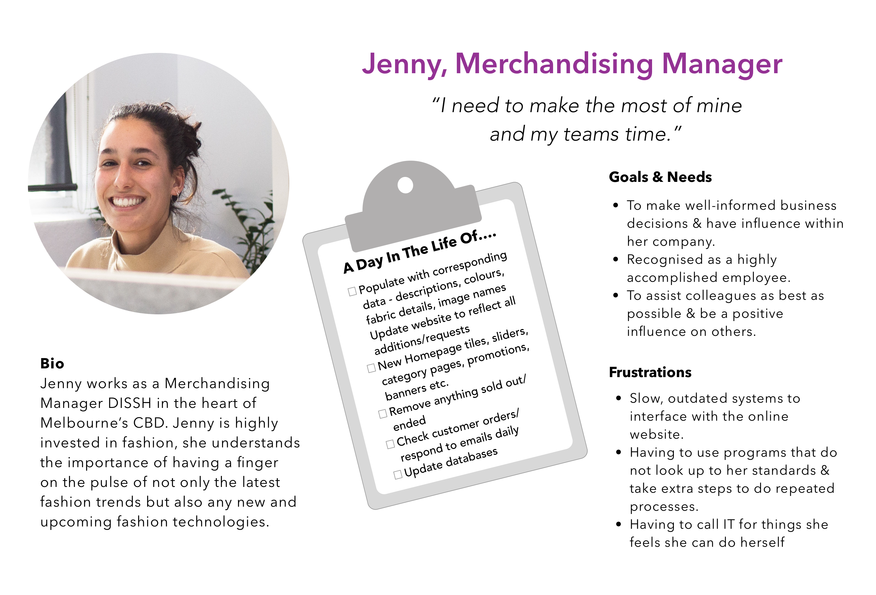
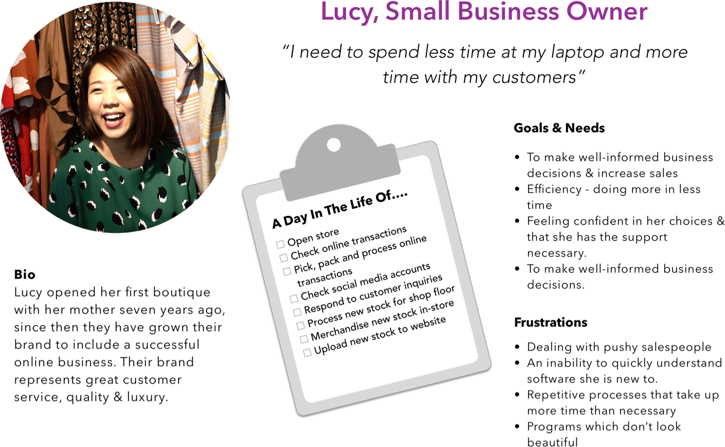
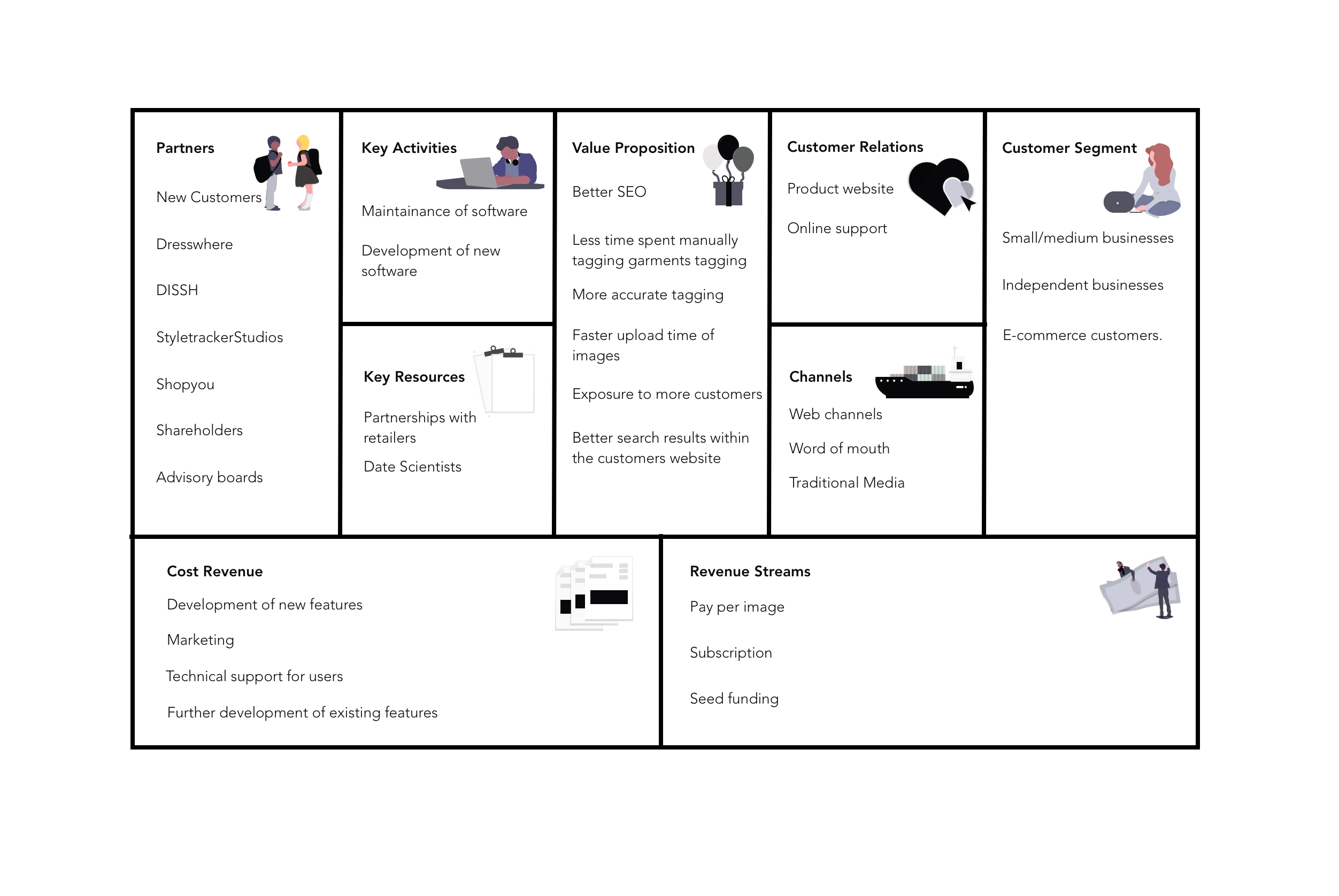
Business Prop
Synthesis
Through our research, we concluded that the website needed to:
- Explain a difficult process
- Educate a new client base
- Eliminate time-consuming practices
- Direct educated users to trial
- Creating trust amongst users
Types of Users/Stakeholders were medium to small businesses
To create an MVP we prioritised firstly solving the main problem: Educated businesses who were looking to increase SEO on their eCommerce website.
Through our research, we concluded that the website needed to:
- Explain a difficult process
- Educate a new client base
- Eliminate time-consuming practices
- Direct educated users to trial
- Creating trust amongst users
Types of Users/Stakeholders were medium to small businesses
To create an MVP we prioritised firstly solving the main problem: Educated businesses who were looking to increase SEO on their eCommerce website.
Solution Statement
Design a simplified platform that allows amatuer clubs and businesses to foster strong relationships and grow.
Design a simplified platform that allows amatuer clubs and businesses to foster strong relationships and grow.
Design a simplified platform that allows amateur clubs and businesses to foster strong relationships and grow.
Design Studio
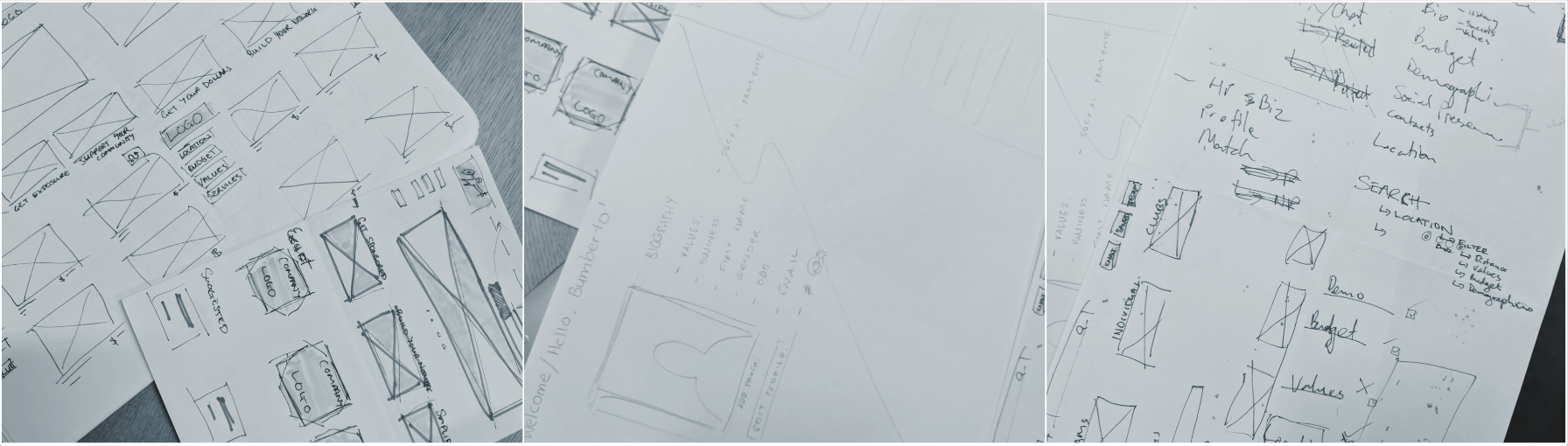
I completed two time-boxed 10-minute design studios to formulate ideas and layouts for our platform's homepage. Most of our initial ideas were inspired by the websites that we had analysed in the comparative analysis. The goal was to achieve a design where the main functionality of the website was easily accessible with simple navigation in an easily digestible format.
We completed two time-boxed 10-minute design studios to formulate ideas and layouts for our platform's homepage. Most of our initial ideas were inspired by the websites that we had analysed in the comparative analysis. The goal was to achieve a design where the main functionality of the website was easily accessible with simple navigation in an easily digestible format.
Usability Testing
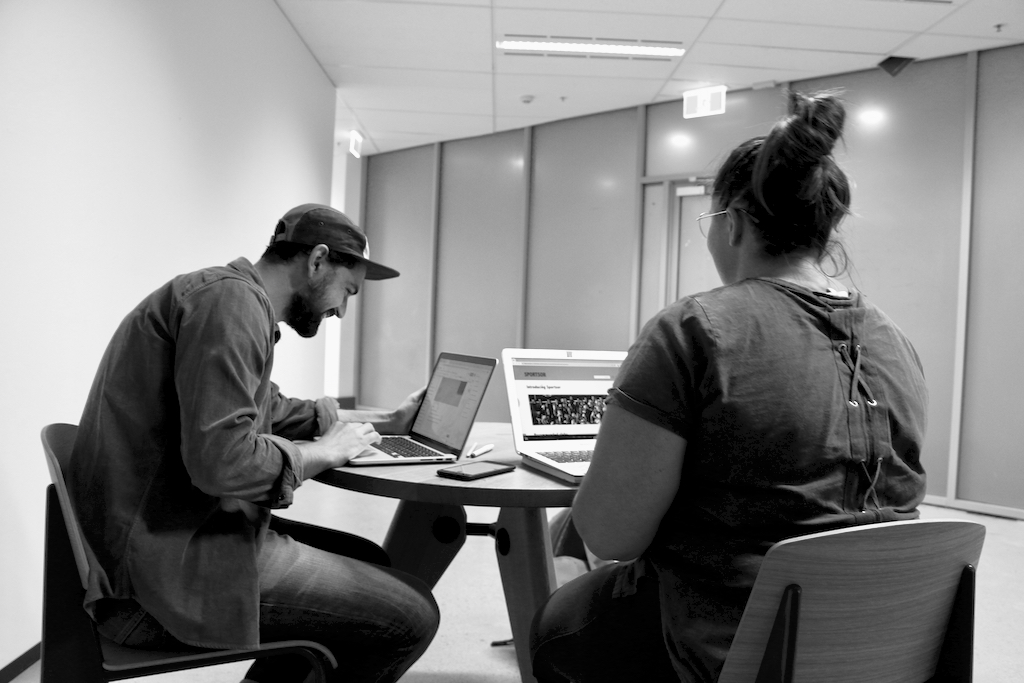
The game plan was to understand how our users would best consume information. By creating simple A/B tests to see if our users understood our content and illustrations better than a video then I would know how to best proceed with our layout and format.
I ascertained that there was difficulty understanding some of the content, however, a video did not prove to be substantially more beneficial. We were also informed on preferences in terms of what should be displayed on a homepage.
The game plan was to understand how our users would best consume information. By creating simple tests to see if our users understood our content and illustrations better than a Video when would then know how to best proceed with our layout and format.
We ascertained that there was difficulty understanding some of the content, however, a video did not prove to be substantially more beneficial. We were also informed on preferences in terms of what should be displayed on a homepage.
Prototype
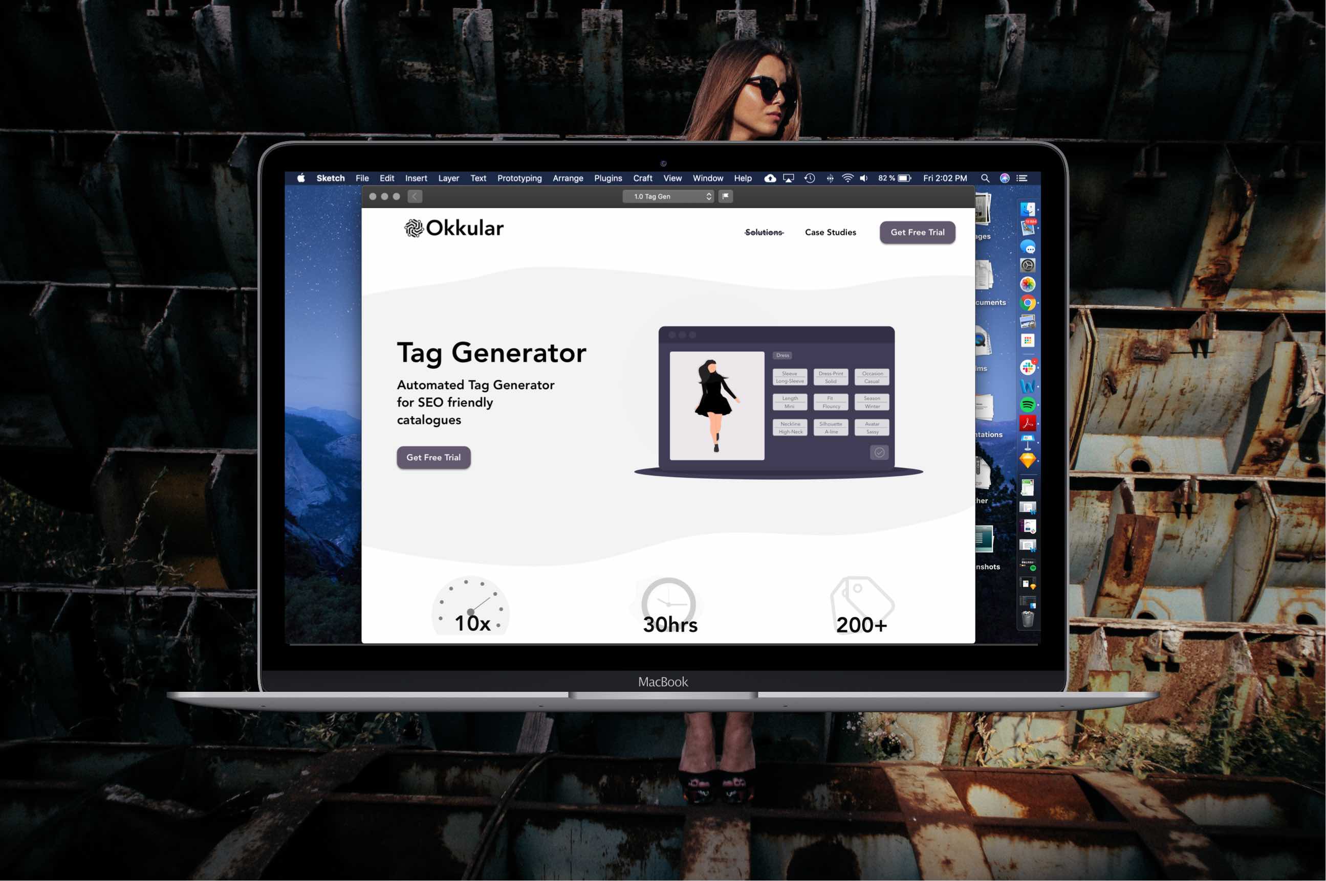
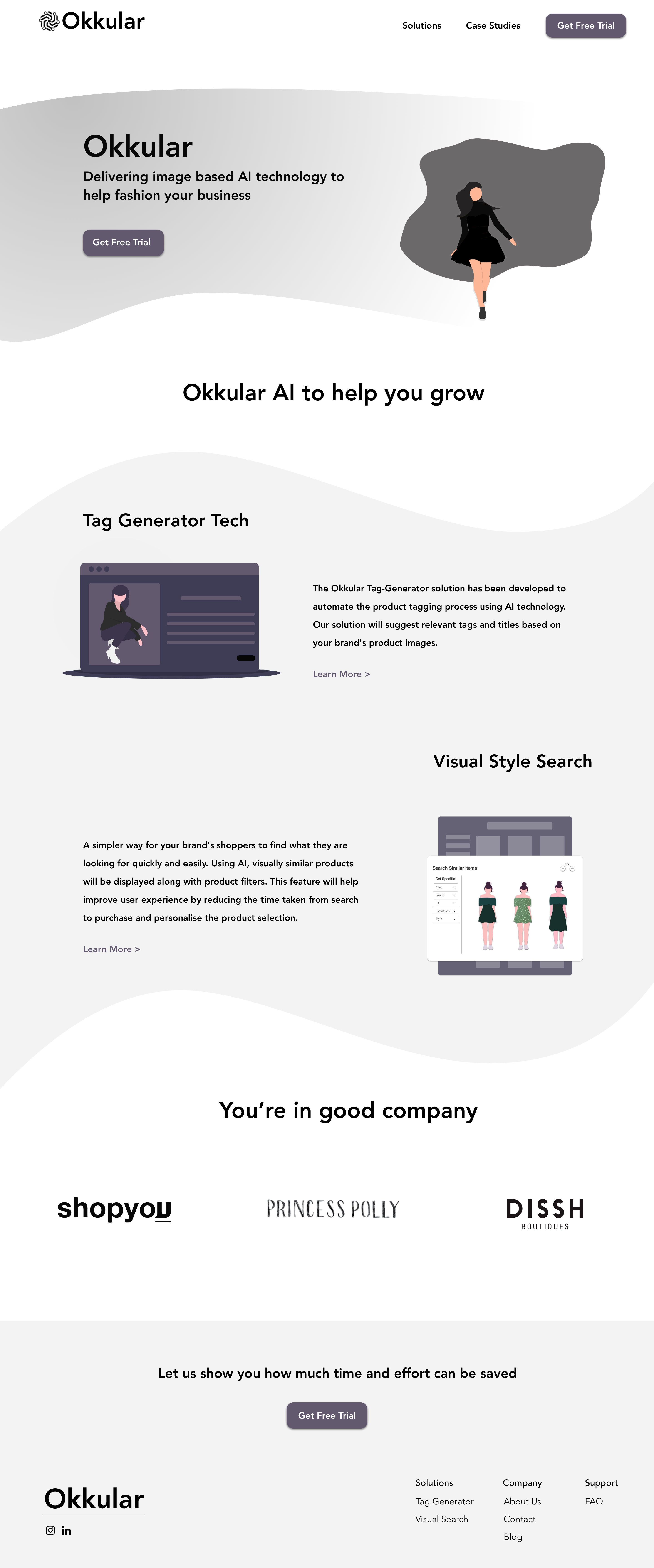
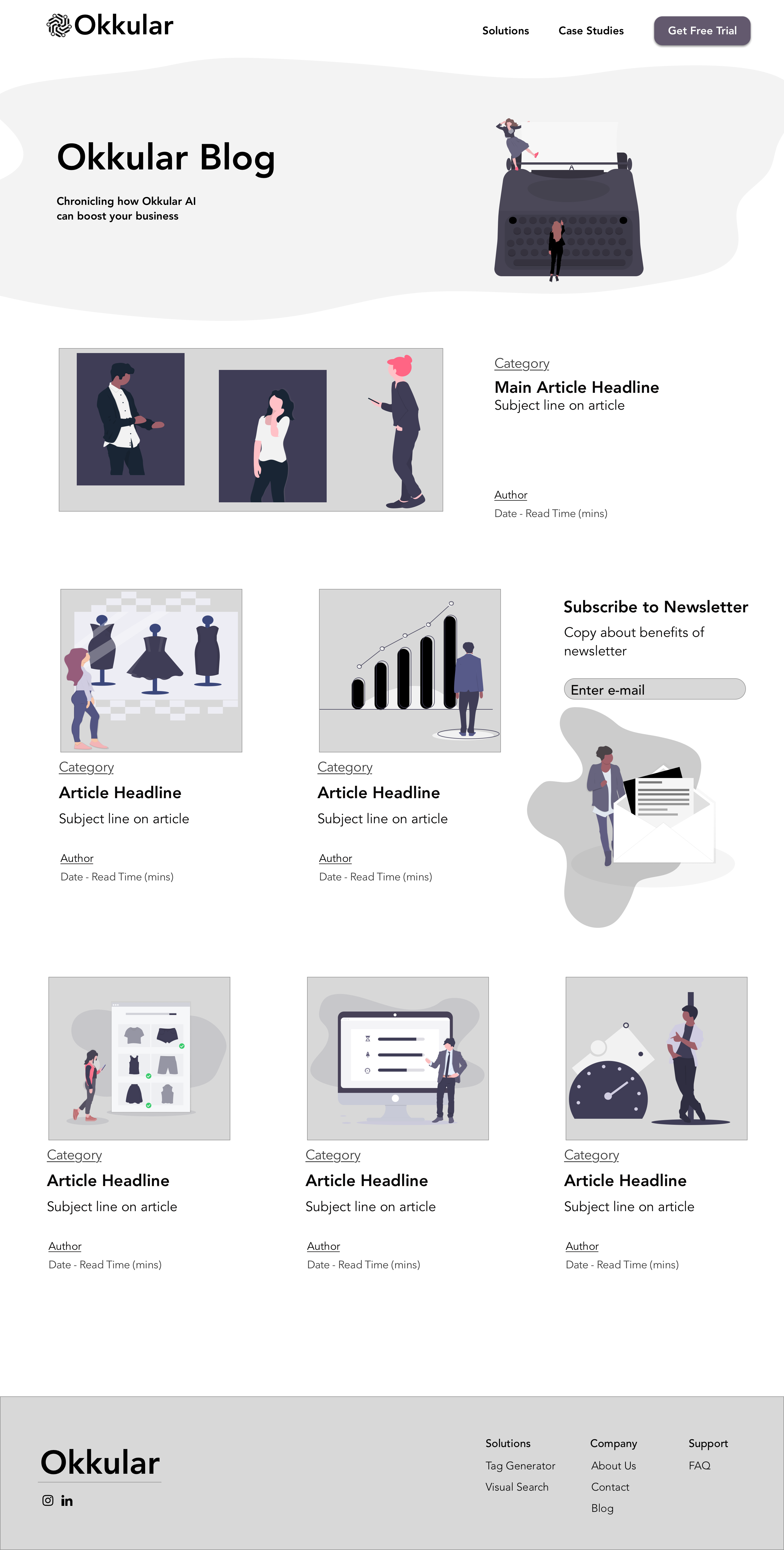
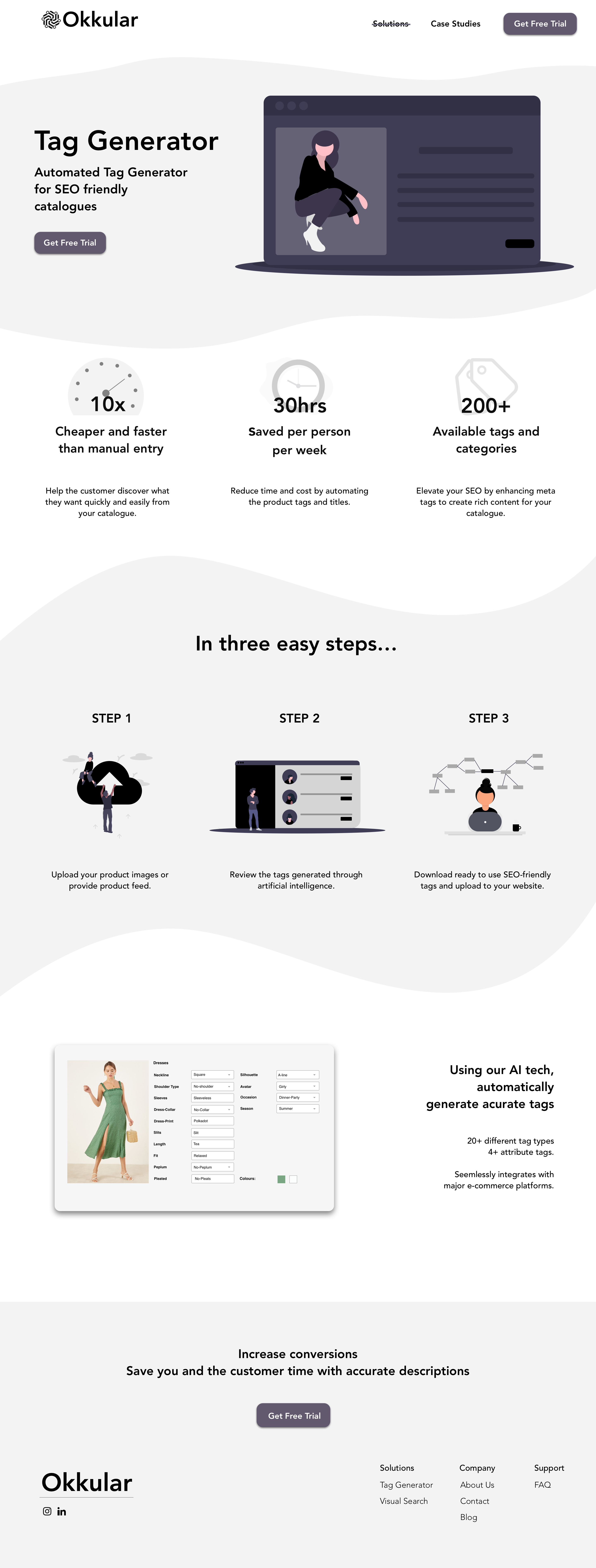
Okkular Screens
Projects

Report a scam - Website takedown serviceUX/UI design of Federal Government service
Okkular Website RedesignUX/UI, Web page redesign, Product design (B2B)
Okkular Web AppProject type
Sportsor AppProject type